A Symbol of Our Mission: Introducing the Simply Serene Logo
Today is a really exciting milestone for all of us.
After exploring many different ideas and designs, we’ve finally chosen the official logo for Simply Serene!
This wasn’t a decision I made alone. Our team spent countless hours thinking about what Simply Serene truly stands for and how we wanted that to be reflected in one simple design. With the help of our amazing team in both the United States and Poland, along with my parents, mentors, and our investors, we found the logo that we believe represents our mission the best.
To me, this logo is more than just a symbol. It represents hope, resilience, growth, and the belief that every student deserves practical tools to navigate life’s challenges with confidence.
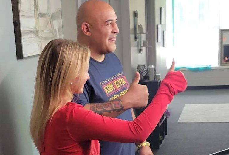
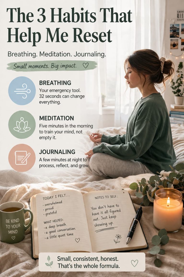
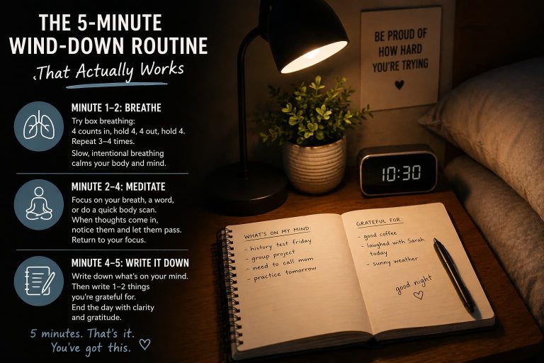
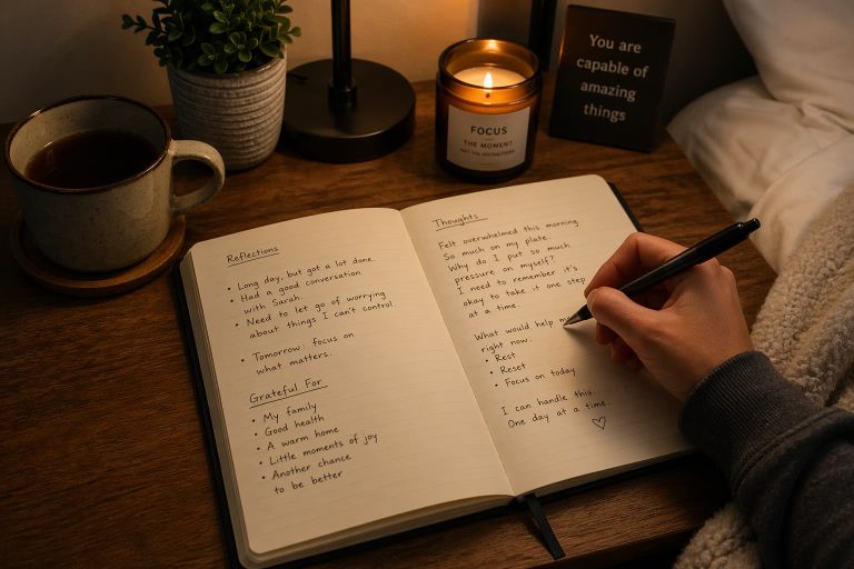
Simply Serene was created to help middle school, high school, and college students manage stress, anxiety, self-confidence, and the pressures of everyday life. By combining guided breathing, meditation, journaling, confidence-building exercises, and a unique mental resilience approach inspired by professional MMA judge James Lee, we’re building something that we hope will make a real difference in students’ lives.
Choosing our logo is another step toward bringing this vision to life. Now our brand truly has an identity, and this is just the beginning.
Thank you to everyone who has supported this journey so far. Your encouragement means more than you know.
Stay tuned – we have so many exciting announcements, behind-the-scenes updates, and interviews coming soon. I can’t wait to share what’s next with all of you. – Anna
Founder, Simply Serene